Faaeq Design

Brand identity
Guidelines

Eco Organics

A natural, confident identity for an organic food and beverage brand, built on the promise of “Health Starts Within”.

Client

Eco Organics

Industry

F&B · Organic food & drink

Scope

Logo, brand guidelines, applications

Tools

Illustrator, Photoshop

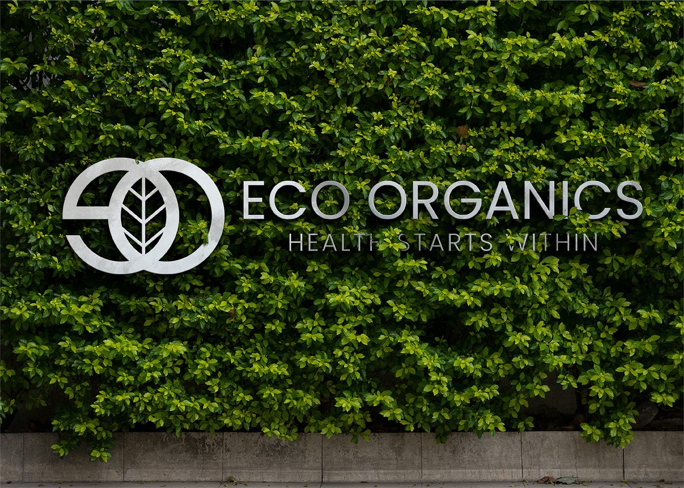
Eco Organics logo in white on a lush green living wall

Communicating health and sustainability without falling into green clichés.

Eco Organics needed an identity that felt honest, healthy and modern, clean enough for packaging and retail, and distinctive enough to own.

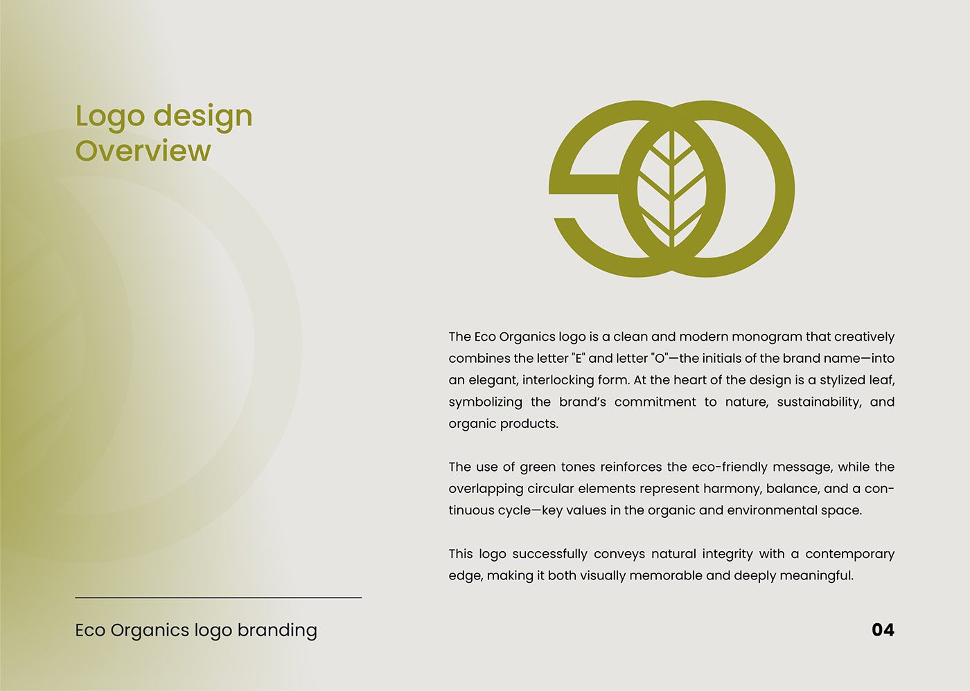
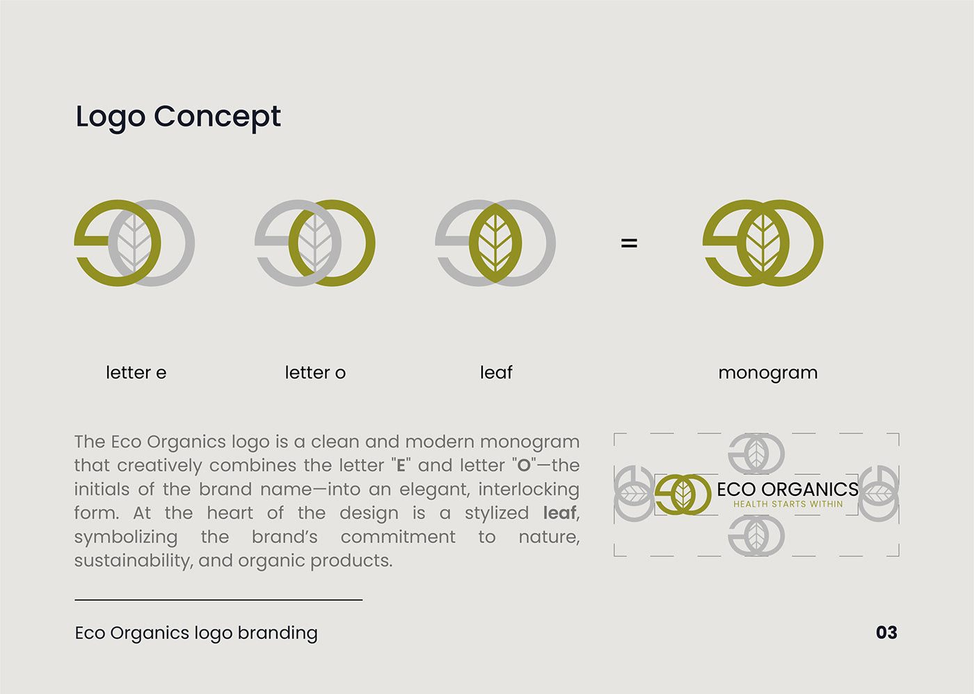
The monogram combines the letters “e” and “o” into two interlocking circles with a stylised leaf at its heart. The overlapping forms express harmony and the natural cycle, while the leaf ties it to sustainability and organic growth.

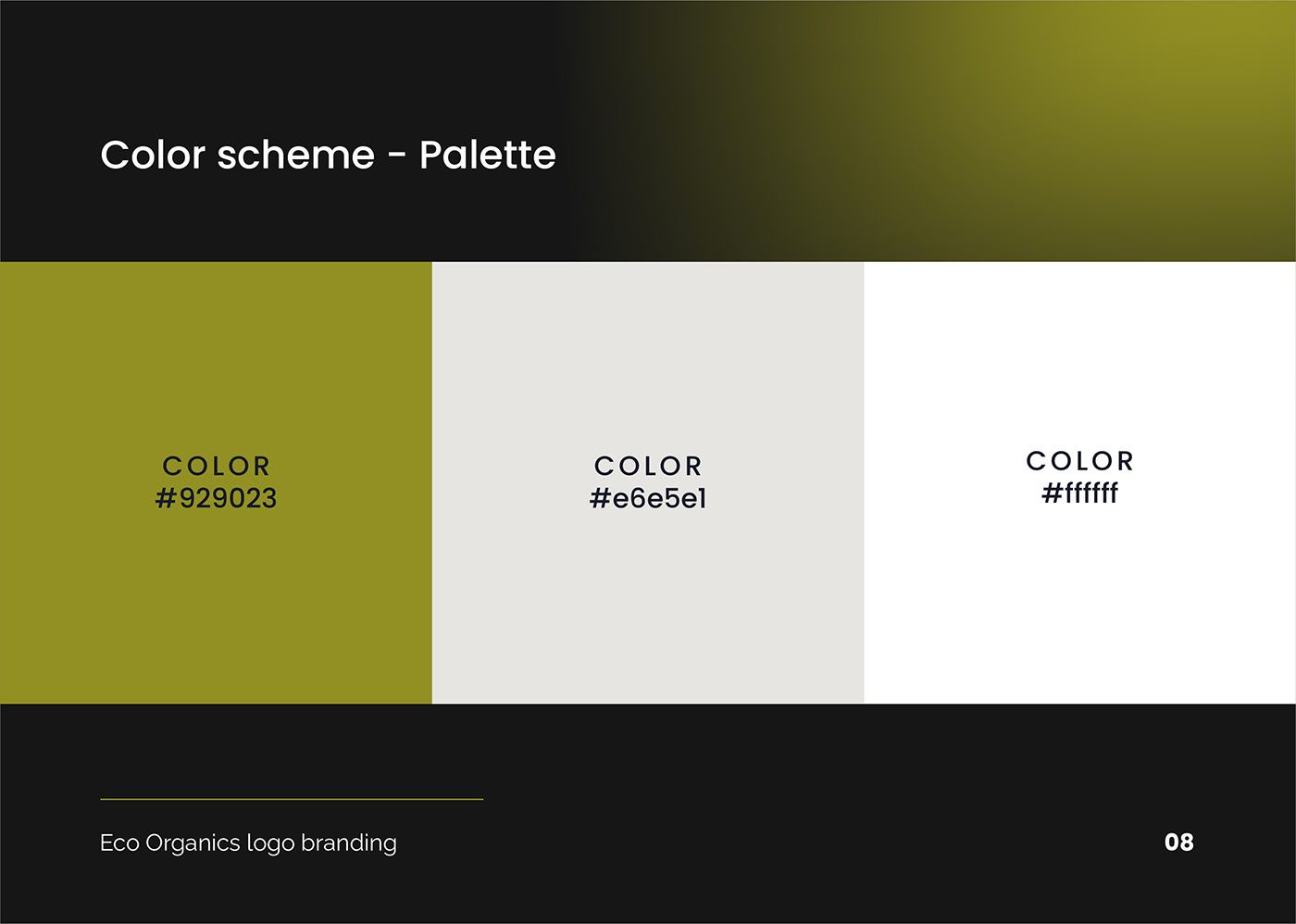
An olive-green palette with warm neutrals and white, set in the Poppins type family, gives the brand a fresh, contemporary voice. Everything is documented in a full brand guidelines book covering logo concept, logo types, colour variations, typography and palette.
Identity in use

Eco Organics logo concept: letter e, letter o and leaf combine into a monogram
Eco Organics logo design overview page
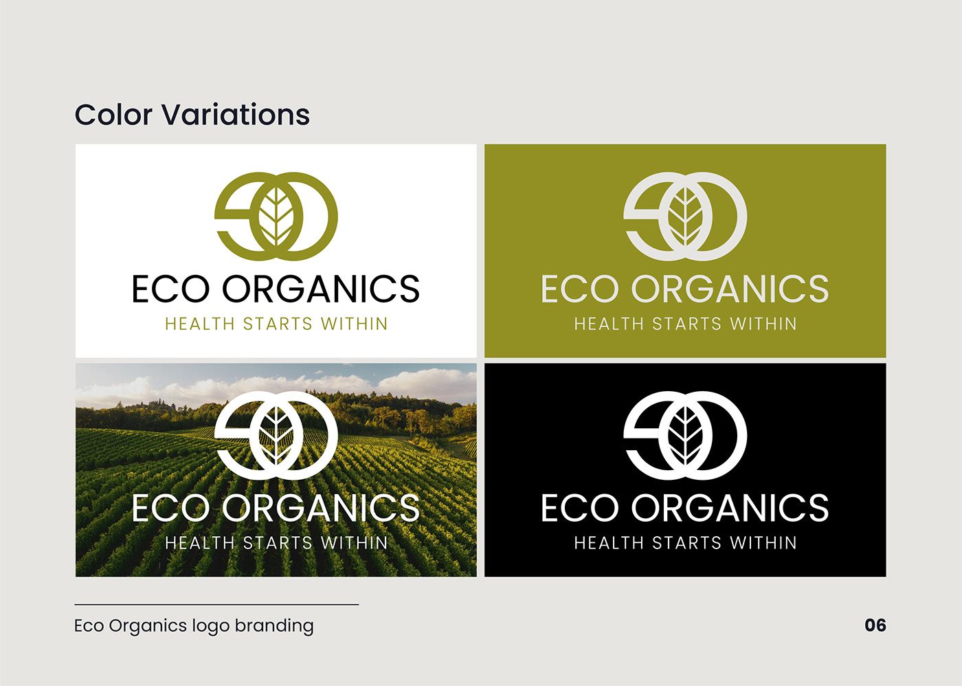
Eco Organics logo colour variations on white, olive, photo and black backgrounds
Eco Organics colour palette page with olive, warm grey and white
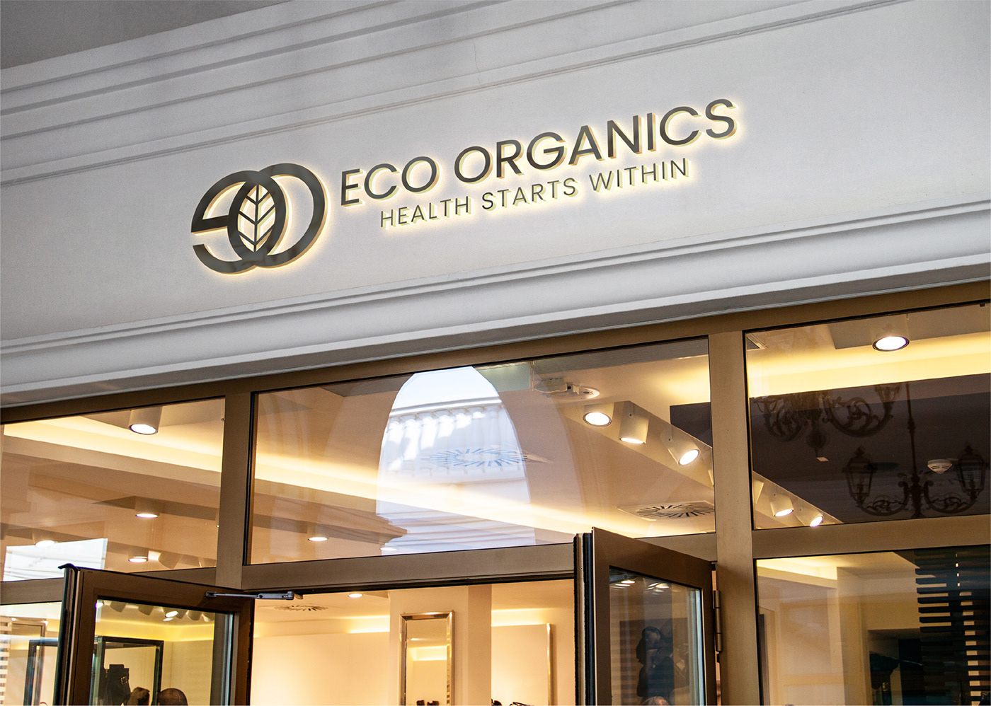
Eco Organics illuminated logo signage on a shopfront
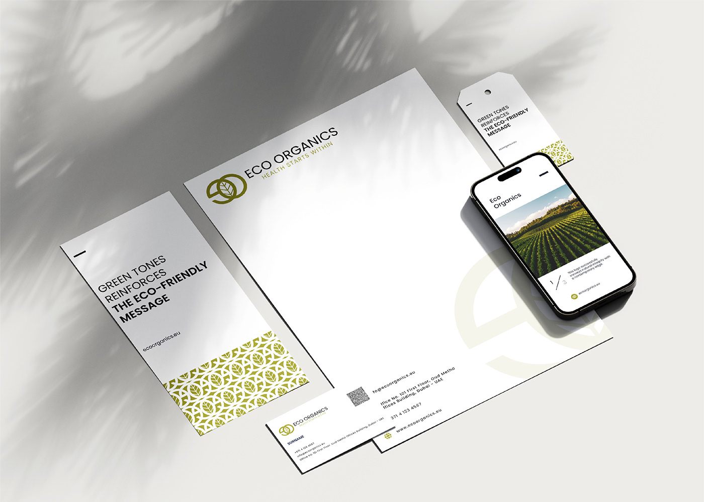
Eco Organics stationery and phone mockup
Eco Organics app icon on a smartphone home screen
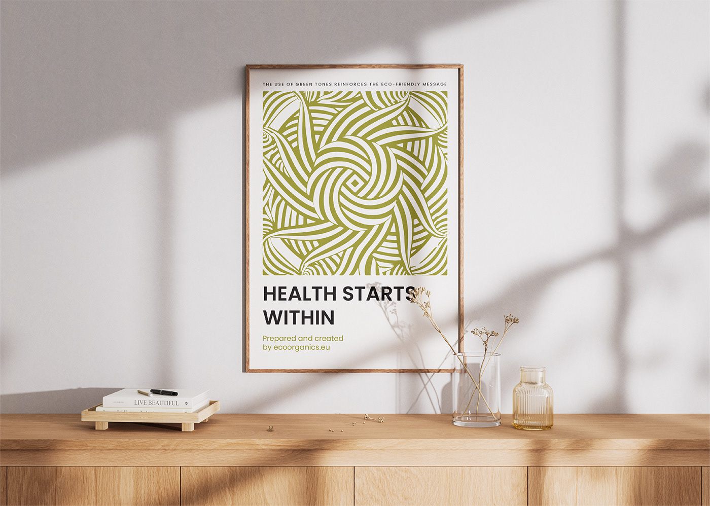
Health Starts Within framed poster on a shelf
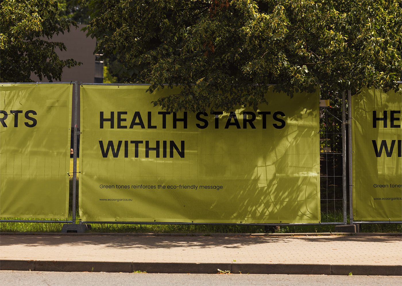
Health Starts Within construction hoarding in olive green

What was delivered

Built with

Adobe Illustrator
Adobe Photoshop

Want results like this for your brand?

Tell me about your project and I’ll get back to you with next steps.